Beneva Pines Full Home Remodel
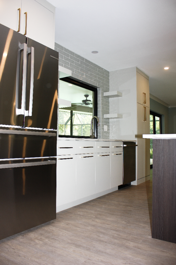
Welcome to Beneva Pines. What a huge transformation. We completely opened up this space, got rid of the existing kitchen, which was kind of closed off in its own little space, in its own little cube, and really opened it up to give it this nice modern aesthetic. We decided to go with this nice two-toned kitchen from Cabico. We did a light gray on the back with a nice warm, rich wood tone in the island, complimented and finished off with some nice gold hardware and floating shelves. And the clients are really ecstatic about the finished product. So we decided to compliment this design with a really nice glass backsplash. It’s in the 3×12 kind of oversized subway pattern, but we did it in a light gray glass that has a bit of wave to a bit, a bit of an undulation, to kind of give it some more interest and add some more texture to the space.
Welcome to Beneva Pines. What a huge transformation. We completely opened up this space, got rid of the existing kitchen, which was kind of closed off in its own little space, in its own little cube, and really opened it up to give it this nice modern aesthetic. We decided to go with this nice two-toned kitchen form Cabico. We did a light gray on the back with a nice warm, rich wood tone in the island, complimented and finished off with some nice gold hardware and floating shelves. And the clients are really ecstatic about the finished product. So we decided to compliment this design with a really nice glass backsplash. It’s in the 3×12 kind of oversized subway pattern, but we did it in a light gray glass that has a bit of wave to a bit, a bit of an undulation, to kind of give it some more interest and add some more texture to the space.

As part of the remodel, the client really wanted to change out the windows and doors, so we really got to explore that option with some cool doors from Origin. They are a sliding bi-folding set, so it’s different than your double bypass sliders. It kind of opens up and really expands the space. We have a standard swing door on the left side, and we have an even number of panes, and the rest of it kind of unlocks and just folds out of the way.
If you guys remember, we had this kind of cool partition that was part of the original architecture of this place. We decided not to use it in this design, even though we thought it was very cool. Coordinating with the client and their furniture, it kind of didn’t really fit into the final design she was looking for, so it didn’t really work for this time. But if you have architectural features in your house that are really cool and really unique and you really like them, find ways to incorporate them into your designs for your remodel.
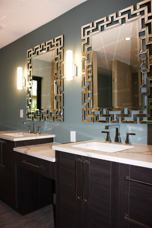
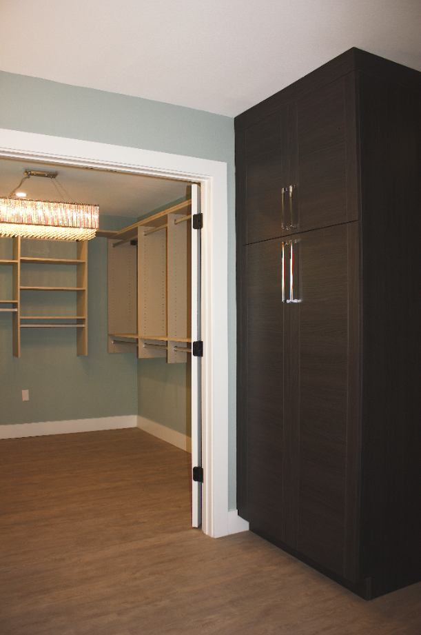
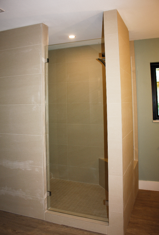
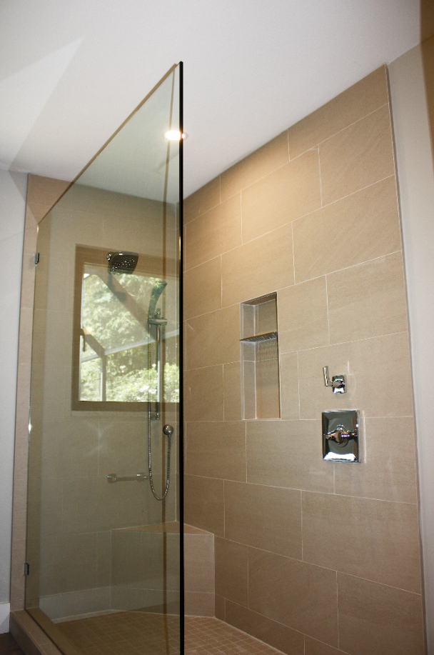
We sort of changed the way you come into the master suite and enter the master bath. We took the original office and made it into a master closet, and completely reconfigured the shower to give us this spa-like feel and really cater to the modern aesthetic that we’ve been talking about. So some cool features about this design are the way we decided to position the glass in coordination with the client’s wants and needs, and to give this kind of interesting look that caters to maybe a little of a hotel kind of design, which people really love. In the quest for storage, we wanted to make sure we added plenty in here. So we did a linen cabinet that matched the vanities, and then the master closet, really looks great with the sweet chandelier, and we partnered with California Closets to come up with this great design.
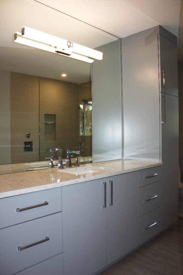
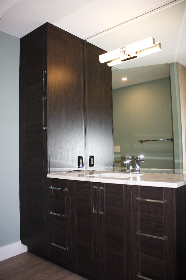
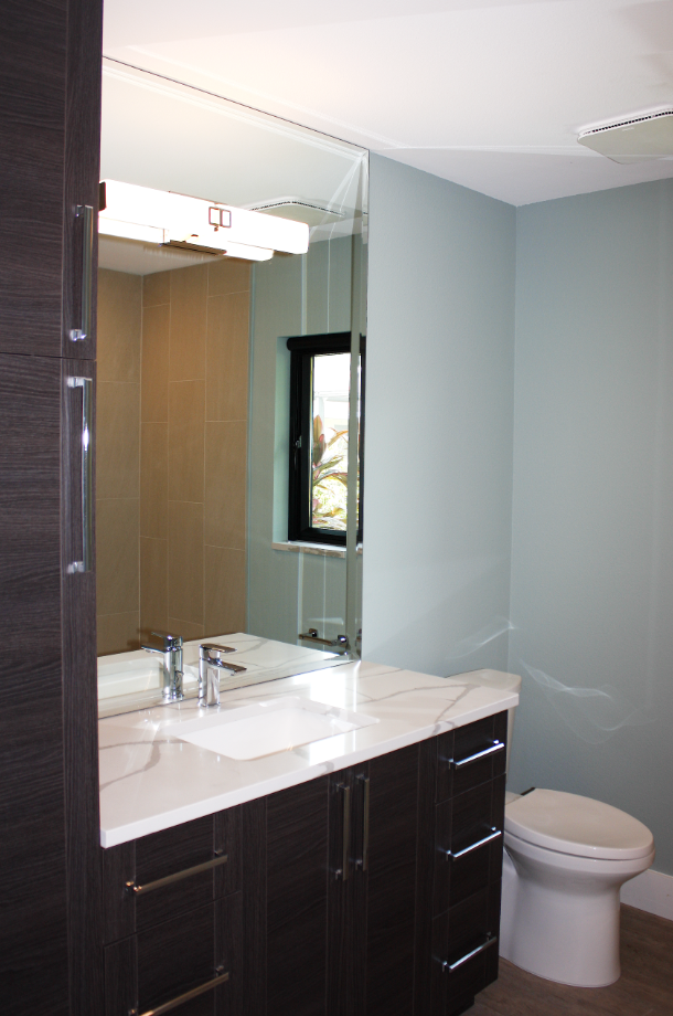
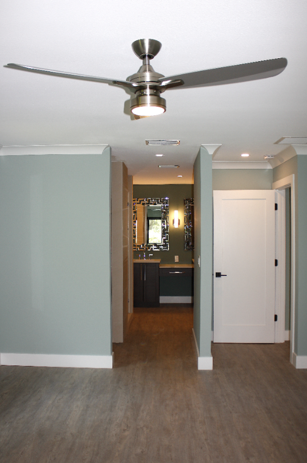
Part of the ides was to open this main space of the home and make it feel more modern, but we also wanted to add a little bit of privacy and separation to this wing, because it kind of becomes or acts as a second master. So let me show you want that looks like. This kind of serves the purpose of that second master, so it’s a great little guest suite. We did an on-suite bathroom over here and a nice walk-in closet as part of the reconfiguration of this space. So you get nice storage, a great place to have all your clothes, and then you have this great on-suite bathroom, tied together with the same paint colors using light gray to kind of coordinate the space. We did a really nice Cambria countertop in here, but we did also use some of the same materials that we used in the rest of the space, just in a different way. You know, we did different cabinet pulls here and a different color, but it’s kind of similar in style. Just little ways to connect the design throughout the space without it matching.
Finishing it all off, we still have a third guest bedroom and guest bathroom, this one serving kind of as your powder bath if you will. It is a full bath, but we still incorporated some of the design elements as the rest of the space. We changed the tint of the paint in here to make it a little bit darker and add a little more drama, which really makes this space feel warm and at home.
Before

After

