Sea Gate Update
We’re excited to show you a new remodeling project in Longboat Key’s Sea Gate Condo. We worked on upgrading the kitchen, a guest bathroom, and the master bathroom. The kitchen originally had some of the typical things that homeowners want to update. This includes those standard white cabinets and raised panels. This homeowner really wanted to bring his kitchen up to date and go a lot more modern.
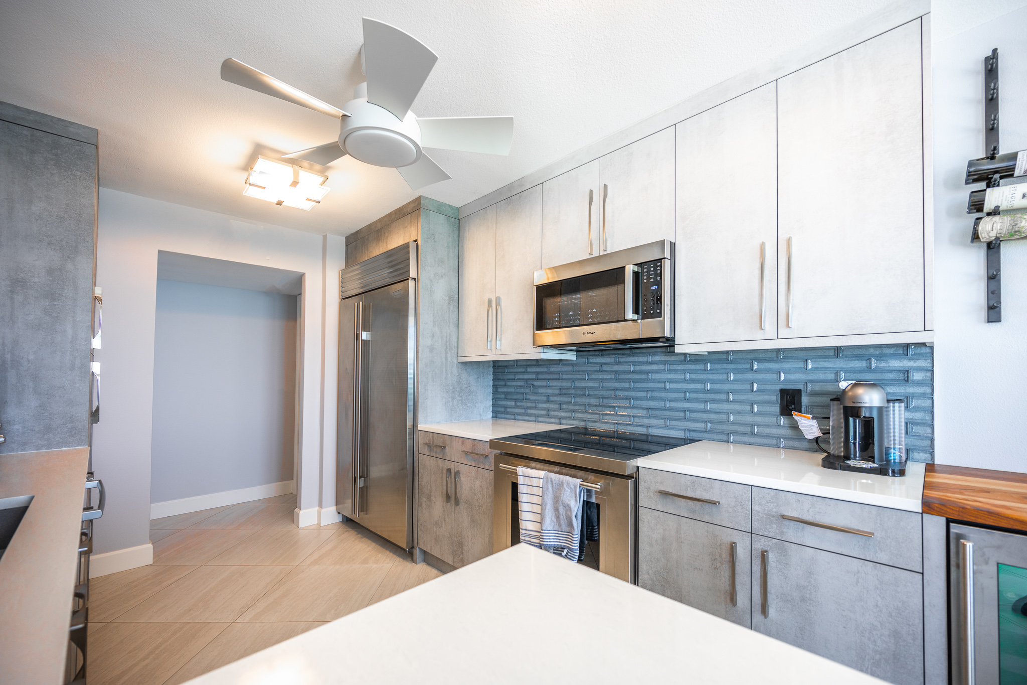
Regarding the backsplash, we wanted to update the design of this Sea Gate condo from a glass tile with a multi-color pattern. We updated it with a bit of a modern element to it to a new glass mosaic tile that brought in some of the blue tones from the ocean that’s right outside the window. This is why he bought the condo in the first place, so we really wanted to connect the inside with the ocean.

> Project Spotlight: Sea Gate Condo Remodel
Concrete-Look Cabinets
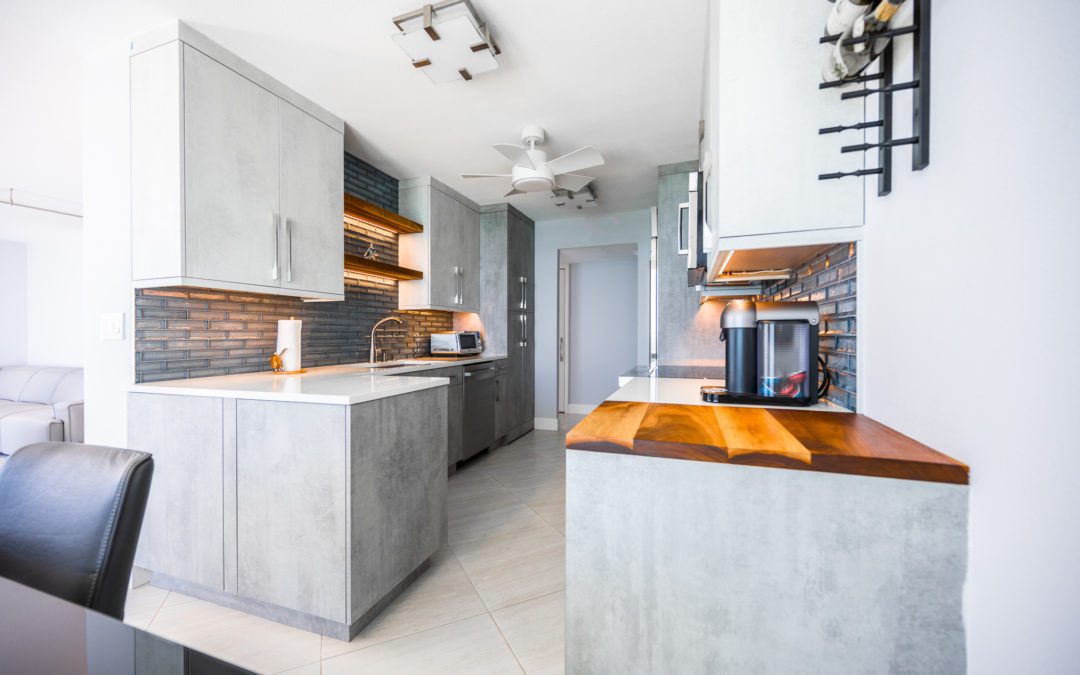
We also brought in a concrete look to the cabinets, which is a really cool feature. The concrete look adds a contemporary feel to the space. The concrete style is part of a two-tone look with dark gray on the lower cabinets and some of the tall cabinets. We also used this style on the upper cabinets. We combined that with that blue glass tile backsplash, again, to bring in that look of the water into the space.
> Project Spotlight: Sea Gate Condo Build-Out
Then to help keep the space from feeling too cold, we added some wood elements with the floating shelves and also a little wood countertop area over the wine cooler, which serves a dual purpose as a charcuterie board built into the kitchen. These little touches really create a big impact in this otherwise smaller kitchen space.
Using the Color Palette
For the guest bathroom, we wanted to continue some of the same color palette from the kitchen with the gray and the blue. We brought the gray tones into the shower area where we used a large format tile to help keep that modern feel. In an accent stripe in the shower, we used a nice glass blue tile that looked like the tile in the kitchen. It was something the client really loved.
Contemporary Master
In the master bathroom, being a little bit bigger than the guest bath, the existing situation was a tub that we converted to a shower. In this case, we made the shower a large walk-in with a linear drain and a wall-to-wall niche. We also continued that tone on tone with the gray wall tiles here. On the side walls, we used a darker gray version of the floor tile. The floor tile and the accent wall were the lighter grays. At the vanity, we used a glass accent tile to again bring in a little bit of color and give it a cool look.
> Save These Photos to Your Houzz Ideabook
We really like the way that this Sea Gate condo turned out. It has a great modern feel. It’s a great example of how you can do tone on tone while adding just a small pop of color. We hope that you love it as much as we do.
Remodeling Your Condo?
Kitchen, Bathroom, or Everything, We’re Your Team

